How to create a pivot table in excel? Excel is a powerful tool in Microsoft Suite. The most important thing you must learn when you are a market researcher or a data analyst is to insert a pivot table. The table is used to analyze huge chunks of data sets and tables. It is quite simple to create this table and hold a lot of synthesized information. You can also modify the output based on your needs. This tutorial would teach you the step by step process to create a pivot table. Before starting the creation of a pivot table, you must learn about the pivot table.
Table of Contents
What is a pivot table, and how does it work?
The pivot table would present the table in a table format. It has the information that is from a data set. The pivot table would group the data and present it in the graphical format. The data would be meaningful and makes it easier for you to carry out the analysis. The descriptive statistics would show the data such as max, min, sum, variance, and standard deviation. This gives how the data looks. The main tool that is used to create the pivot table in the companies is Microsoft Excel. It offers many benefits and is the tool with which many people are already familiar with. Though you can create the pivot tables using other tools, but widely accepted in Excel.
Here is how to create a pivot table in excel
There are some employee data used, such as first name, surname, gender, state, salary, age, family status, occupation, and region in the excel sheet. Using this information, we are now creating the pivot table.
Insert a pivot table
How to create a pivot table in excel? You must make sure that you have added all the data without missing values since it impacts the summary statistics. Ensure you write the column names correctly, as these are the labels shown in the summary table.
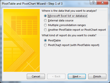
There should not be any subtotal in the row or column in the input data since this takes a toll on the table summary. When the data is ready, you must create the pivot table. Initially, you must select the table. After that, go to the Insert tab and select the pivot table.
The Create Pivot table window is displayed. It shows the options of where you would like to place the pivot table. The first would show the data range you would like to use.
The second would ask where you would like to insert the table, i.e., in the new sheet or the existing one. It is recommended to use a fresh worksheet. The Pivot table fields are displayed on the right-hand side. You can select the options based on how you want to see the pivot table.
Set intentions
You should know what the result must be before starting to create the table. With pivot tables having many options, you should be clear on your goal; otherwise, you must explore every option.
The output that you must focus on the pivot table would look like this – creating a summary for salaries in various regions, creating a table between gender and occupation, and so on.
Create a summary
The best function that is offered by the pivot table is the summary. You must see whether or not there are any differences in the salaries between the regions. The main thing you must know when creating the pivot table is what the columns to be analyzed and how the columns selected would be represented graphically.
There are two blocks that you see on the pivot table fields on the right side. You can choose the columns that you want to analyze. In this case, you can analyze the region and salary.
So, you must select the checkbox next to those fields. You can see them on the workbook of the pivot table.
The second box for the column selection would give you the table design of how many columns should appear. The process is simple. All you need to do is to drag the column and drop in the fields based on where you want to see the data.
Here are the options that you can see when you are looking for what is a pivot table and how it works:
Values: You must add the column data that you want to see as an output in this box. For instance, the salary column would be added to know the salary details per region.
Filters: You can create a custom filter that allows you to remove some data and show only the relevant data for analysis.
Columns and rows:
You must select and drag the input column you want to appear as a column or row in the pivot table. Then, you have to distribute the columns that are analyzed based on your preferences. You can keep on changing the design to find the best way to present the data.
Create a cross table
The crosstable is the one that allows you to cross two columns with each other to see how the values are distributed within the second values. Take an example of gender and occupation.
You can learn the different occupations in which the female and male employees are working. The occupation will have multiple values over gender. It is best to put the gender in the row to make the table readable. You must pull the occupation in rows, and gender is columns.
Create a visualize effect for the table
The best thing about the pivot table is to present the table in the graphical format. When you want to present the input data’s results in a beautiful format to the stakeholders of the company, you must use good graphs. It can make them understand the data you are presenting easily.
Gender and occupation would be easier for people to understand when you create a bar chart. You must go to Insert and click on Recommended charts. The data grouped in the pivot table is taken to represent in the bar format.
Conclusion
This is the step by step guide on how to create a pivot table in excel. It makes the life of a data analyst simple.